You post 30 tweets a month, maybe 50, and you have no clean way to see which ones actually drove engagement. X’s native analytics on desktop now sit behind X Premium, and even when you pay, the table view is too shallow to filter, sort, and act on. What you really need is a workflow that helps you identify best-performing tweets, rank every tweet on the same scale, spot patterns inside the top decile, and turn winners into a content brief you can actually use.
Key Takeaways
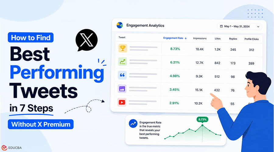
- A sortable, filterable view of every tweet from your X account with engagement rate, impressions, likes, replies, and click data per post.
- The exact sort-then-filter sequence that surfaces real winners (not the loudest tweets).
- A 7-step workflow you can run on the first Monday of every month in about 20 minutes.
- Built on Circleboom’s Engagement Analytics dashboard using official X Enterprise APIs. Start with find best performing tweets to begin analysis.
Why Does Sorting by Engagement Rate Matter?
Most creators are stuck on the wrong metric. Sorting tweets by likes gives you a list anchored to reach, rather than resonance. A tweet with 200 likes on 100,000 impressions has a 0.2% engagement rate. A tweet with 80 likes and 700 impressions has an engagement rate of 11%. The second tweet is the better signal for content strategy, but a likes-only sort buries it at the bottom of the list. Engagement rate is the only metric that compares tweets fairly across time, follower count, and reach. If you have not been sorting by it, you have been making content decisions on noise.
The Engagement Analytics dashboard in Circleboom is built around that discipline. Because Circleboom is an official X Enterprise developer, data is obtained through authorized API access, with no scraping or workarounds in the loop. If you have ever wondered why you can not see your tweet analytics the way you used to, the answer is that X tightened native access. A third-party dashboard with Enterprise API authorization is now the cleanest way to restore the full per-post view.
How to Find Your Best Performing Tweets?
Follow this simple workflow to identify, sort, and analyze your highest-performing tweets using engagement rate, impressions, and key performance signals.
#1 Phase: Connect and load your tweet history
- Log in to Circleboom Twitter and authorize with official OAuth. The connection takes about 30 seconds.
- Open the X Post Planner menu from the left sidebar and select Post Engagement Analytics. The dashboard loads every tweet from your active analytics window into a sortable table.
#2 Phase: Sort and filter to surface real winners
- Sort the table by engagement rate in descending order: This is the only sort that ranks tweets fairly across reach and time. Likes sort, retweet sort, and impression sort all favor distribution over resonance. If you need a refresher on the math, the Twitter engagement rate calculator walks through the formula.
- Filter by date range to scope the view to a meaningful window. A 30-day window works for monthly review cadence. A 90-day window works for quarterly strategy reviews. Avoid filtering shorter than two weeks; the sample gets too small to spot patterns.
- Apply the media-type filter (image, video, text-only, thread) to compare format performance head-to-head. This is where most content strategy decisions hide. You will often find that one format keeps you engaged, and another eats up slots.
#3 Phase: Act on what the sort reveals
- Identify the top decile (top 10% of tweets by engagement rate) and look for three patterns: format (short text vs. thread, image vs. video), topic (which subjects in your niche), and timing (which posting windows). The pattern recognition is the actual deliverable. Reading the list does nothing unless you extract the structural lesson. What to tweet based on past post analytics is a useful complement here.
- Take action directly from the dashboard. Reshare top performers on Auto Retweet to hit time zones you missed. Reschedule the winners for peak windows. Send the borderline ones through the AI Tweet Rewriter to test variations. The dashboard is built as an action layer, not a passive report.
The reason the order matters is this: sorting surfaces the winners, filtering narrows the scope, and pattern-extraction converts data into decisions. Skip any of the three, and the workflow falls apart. Sorting without pattern-extract gives you a list with no lesson. Pattern-extract without sort gives you a guess.
Quick Recap of the Workflow
- Connect with official OAuth.
- Open Post Engagement Analytics.
- Sort by engagement rate.
- Filter by date and media type.
- Extract patterns from the top decile.
- Act inside the dashboard (reshare, reschedule, rewrite).
You can check the full Engagement Analytics view and run the entire workflow in about 20 minutes after you do it once.
What Will You See After One Pass?
The first time you run this loop, you will likely notice three key surprises.
- First, a tweet you barely remember will appear in your top decile by engagement rate. Likes-based sorting usually buries it, but engagement-rate sorting brings it to the fore—this is your real information gain.
- Second, your assumptions about formats will get challenged. Many creators find that thread starters earn deep impressions but have a lower engagement rate, while short observational tweets often perform better in terms of engagement quality. This becomes clear immediately in a single dashboard view.
- Third, impressions and engagement would not move in sync. Impressions are driven by distribution, while engagement reflects content fit. Separating these two signals is the core advantage of this workflow. For deeper analysis, you can combine this view with Twitter Content Performance Analysis for content-type trends or Twitter Account Analysis for overall account health alongside post-level performance.
A useful improvement after a few cycles is tracking engagement rate against a rolling 90-day baseline. This helps normalize seasonal swings, where an 8% engagement rate might be strong in a slow period but average in a high-activity period. The date filters make these comparisons straightforward. Another refinement is to track profile clicks alongside engagement rate. Engagement shows resonance, while profile clicks indicate follower intent. Some tweets perform well with your existing audience but do not attract new viewers, while others do the opposite. Together, the two metrics provide a clearer picture of performance.
Your Next Action
The single decision that compounds is this: stop sorting by likes, start sorting by engagement rate, and run the loop once a month. If you do nothing else from this guide, do that.
- Run the 7-step workflow on the first Monday of next month.
- Reshare the top 5 tweets by engagement rate on Auto Retweet.
- Rewrite the next 5 with AI and test variations.
- Document the format and topic patterns you find.
- Use those patterns as the brief for your next month of content.
Frequently Asked Questions (FAQs)
Q1. Do older tweets show complete metrics?
Answer: Older tweets may have partial metrics, depending on when X started exposing the underlying data for each post. Tweets within your active analytics window (typically the last 12 to 24 months) include the full set of metrics. Anything older than that should be treated as directional rather than exact.
Q2. Can I export the sorted tweet list?
Answer: Yes. Circleboom supports CSV export from the analytics view, making external pattern analysis easy if you want to import the data into a spreadsheet or BI tool. Most accounts find the in-dashboard sort sufficient, but the export is there when you need it.
Q3. Is this safe to run on my account?
Answer: Yes. Circleboom is listed in X’s enterprise customer directory and operates through authorized Enterprise API access. No scraping, no unofficial workarounds, no risk of rate-limit suspension. Your account stays compliant with X’s terms while you run the workflow.
Q4. How often should I run this loop?
Answer: Monthly is the sweet spot for most creators. Weekly is too noisy (small sample sizes); quarterly is too slow (you lose the iteration cycle). The first Monday of every month is a clean cadence that pairs naturally with content-calendar planning.
Q5. What if my engagement rate looks low across the board?
Answer: That is a signal, not a failure. A low baseline engagement rate usually means one of three things: the audience is misaligned with your content, the formats do not fit the platform, or the posting times are off. The same dashboard shows which of the three it is, and the Twitter Content Performance Analysis view drills into the diagnostic.
Recommended Articles
We hope this guide to find the best performing tweets helps you improve your content strategy. Check out these recommended articles for more insights to grow your online presence.